Zurich Insurance Brasil, 2020
From confusion to clarity in insurance journeys.
Policyholders could not find their policies, understand claims, or get help without calling, and that reflex was drowning the call center. I redesigned the portal and main site end to end, managing five designers and bridging stakeholders from São Paulo to Zürich, and calls dropped 65% while satisfaction climbed 22%.
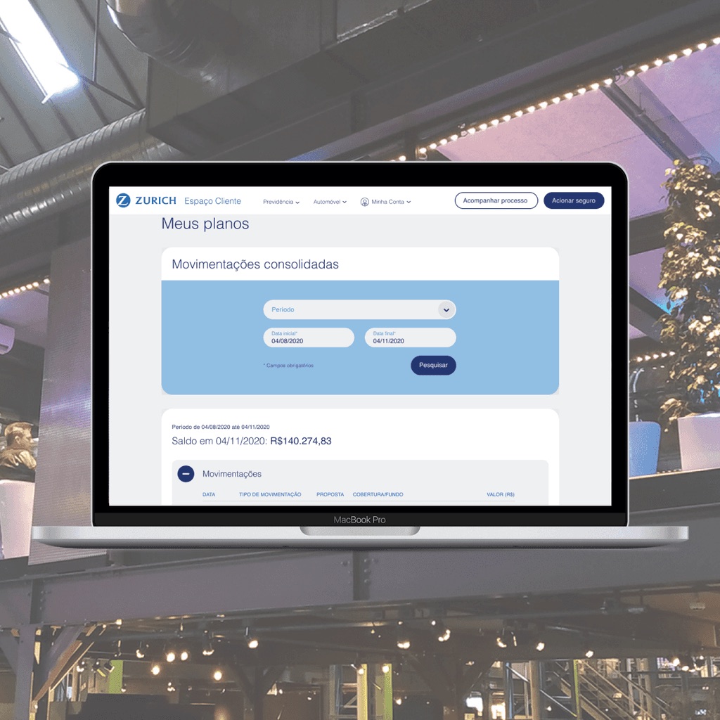
- Role
- Lead UX Designer
- Scope
- Customer portal, main website
- Team
- 5 designers, bridging Brazil BU and Swiss stakeholders
- Year
- 2020
01 Impact
02 Context
Customers struggled with the basics: seeing all their policies in one place, understanding how claims worked, opening a new claim, and getting timely help. Every gap in the digital experience became a phone call, hurting both satisfaction and service costs.
03 What I did
- Managed a team of five designers while bridging the Brazilian business unit and headquarters stakeholders in Switzerland, across languages and time zones.
- With no budget for traditional research, got creative: shadowed call-center agents and listened to real support calls to map the true pain points.
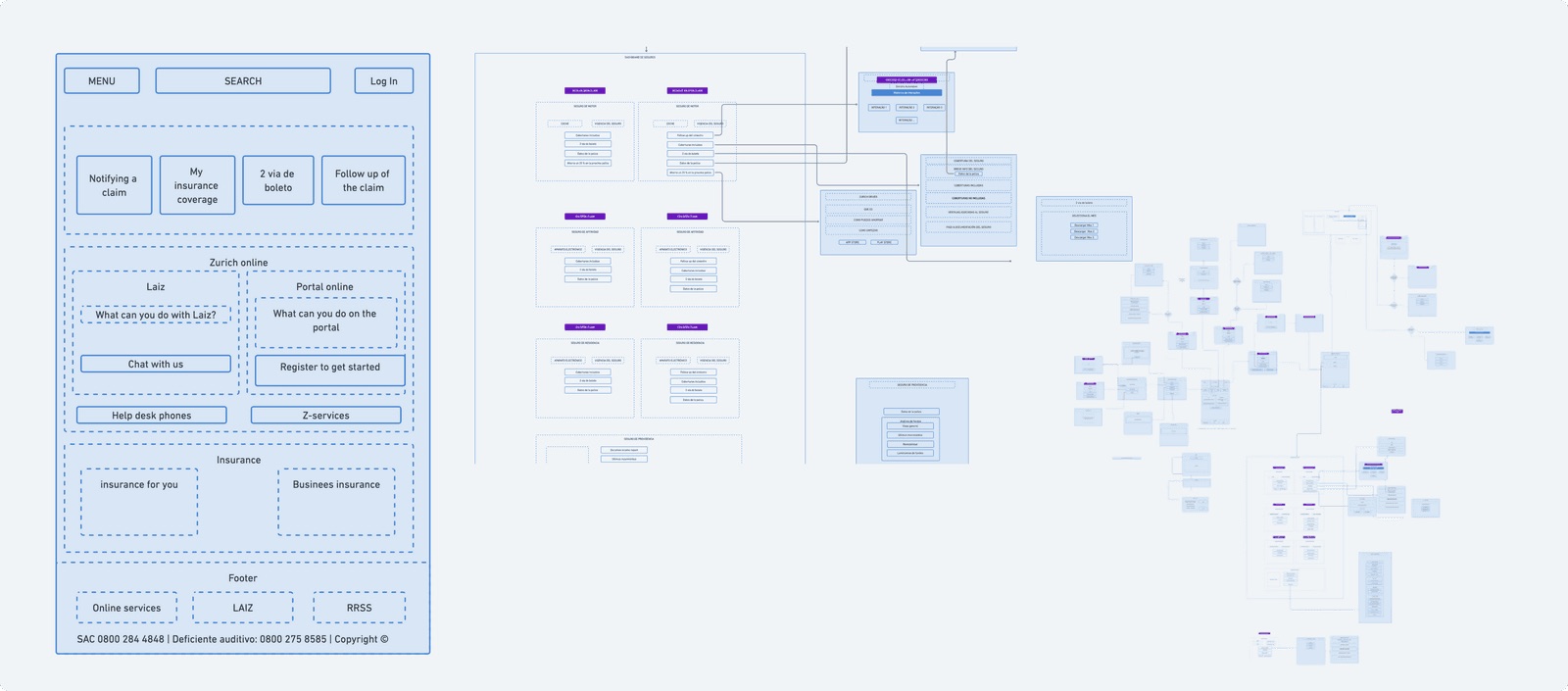
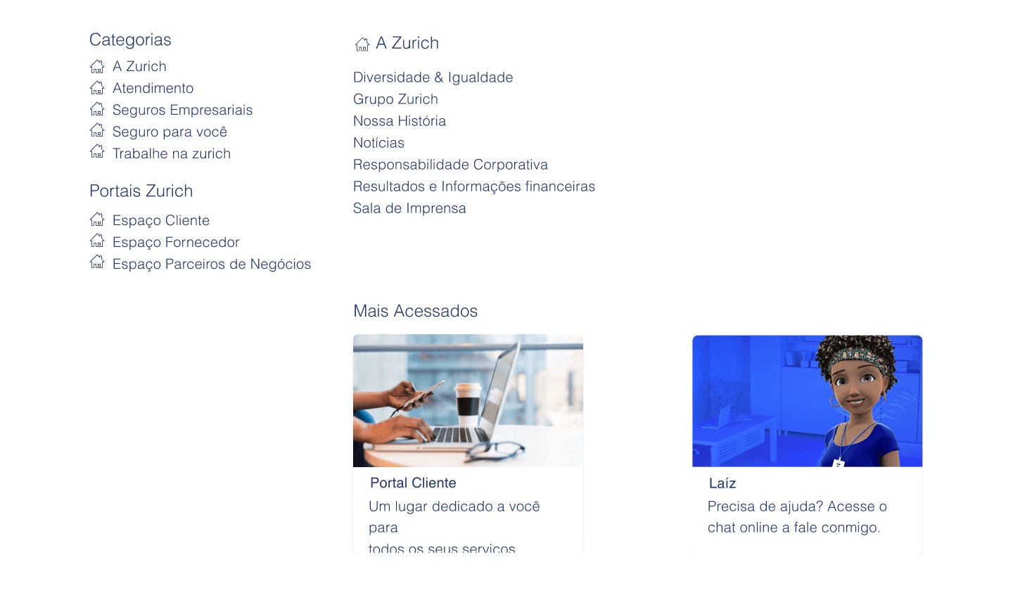
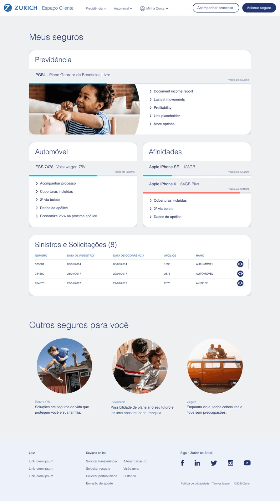
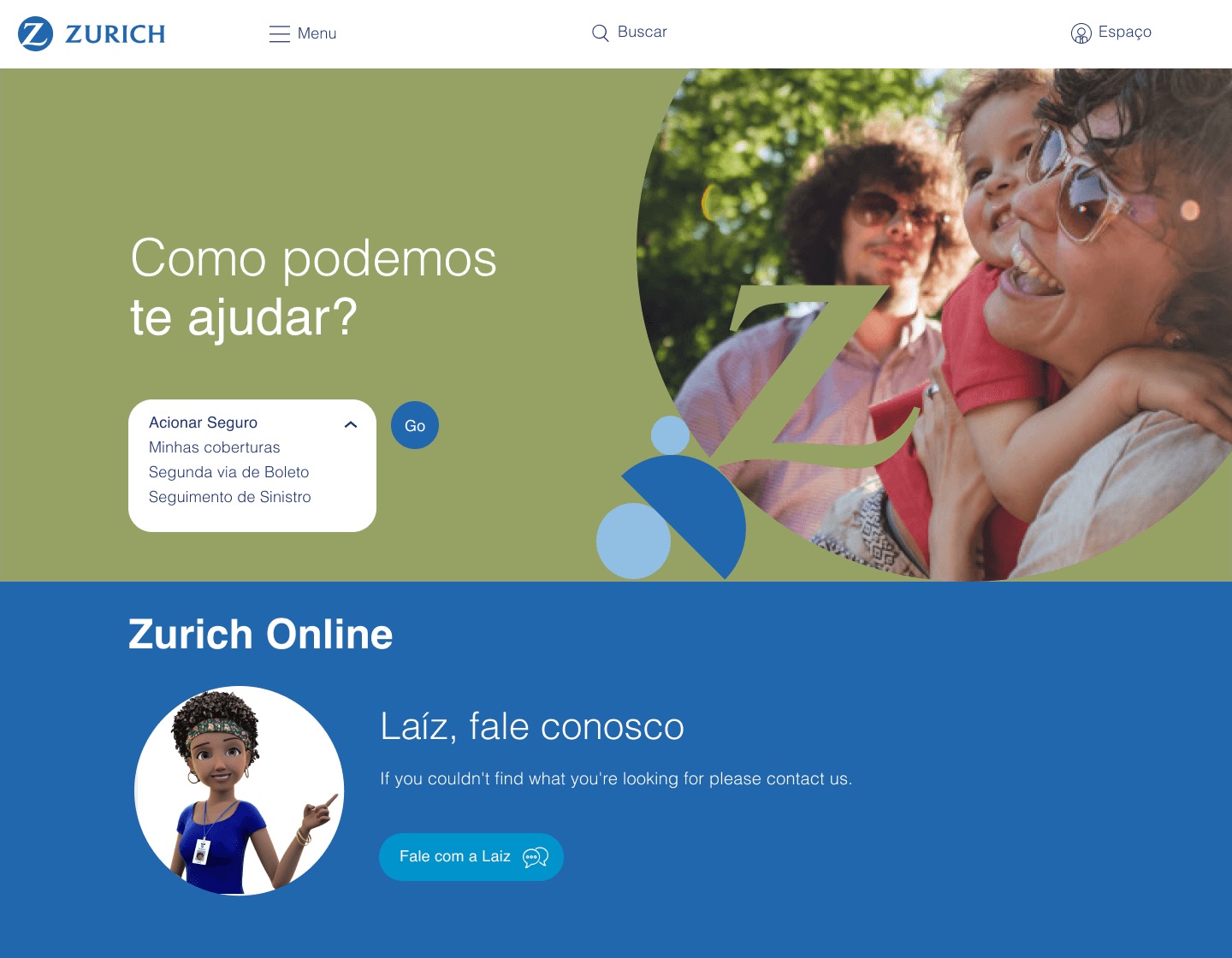
- Centralized policy management into a single platform, with the redesigned site header acting as the customer's hub.
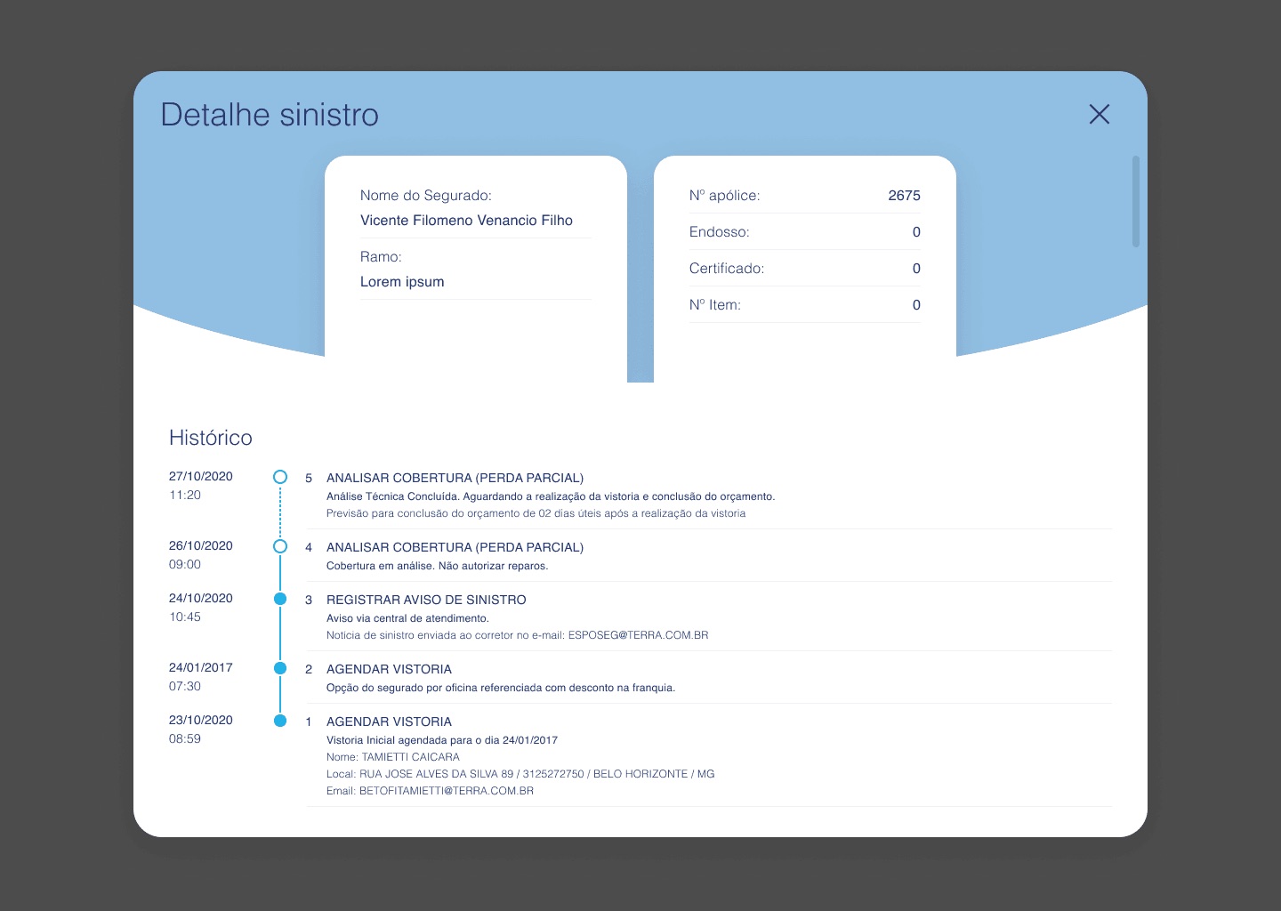
- Made the claims journey transparent with step-by-step guidance, an intuitive claim-opening flow, and integrated chatbot support for real-time help.
04 The portal
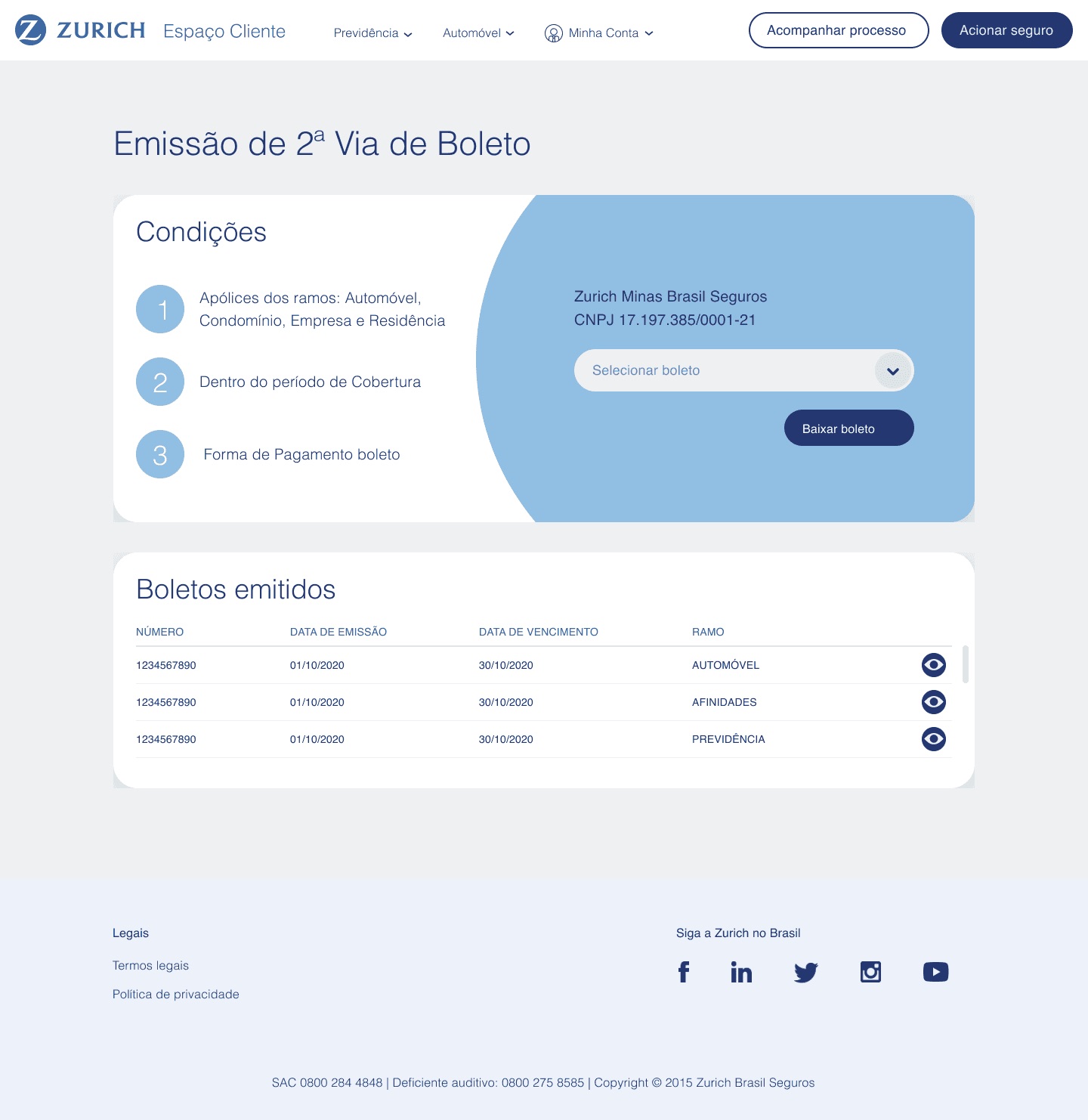
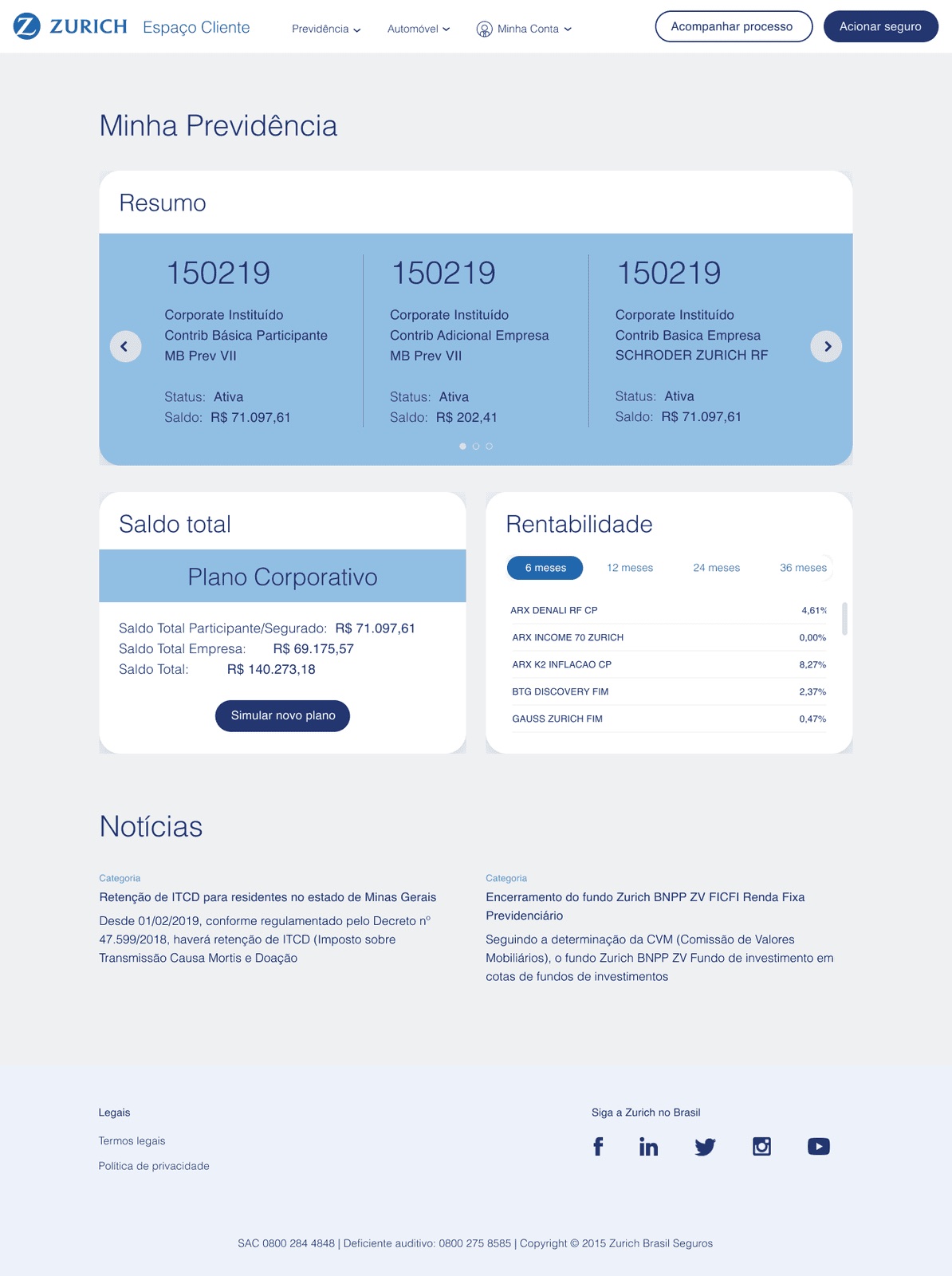
Every policy, claim, and payment in one place, with the status visibility that used to require a phone call.
05 Why it worked
The metrics that mattered were operational: a 65% drop in call-center volume and a 22% lift in customer satisfaction. When research budgets are zero, the support line is a goldmine, the calls customers make are the tasks the product fails to do. No budget, hard constraints, stakeholders on two continents: exactly the kind of problem I like being handed.
Liked this? Want to hear the whole story?
Let’s talk →